
3 posts tagged with "jmeter"

View All Tags

· 4 min read

JMeter, a popular open-source software tool designed for load testing and performance measurement, provides a built-in reporting feature known as the 'Dashboard Report'. The Report gathers or collates the results of performance tests, depicting them in an easy-to-comprehend tabular format and graphs. In this article we will have a look at the "Statistics" table.

Although the detailed process of generating this report is beyond the scope of this article, we have another post where you can find out how to generate the JMeter Dashboard Report.

The Importance of the Statistics in JMeter Report

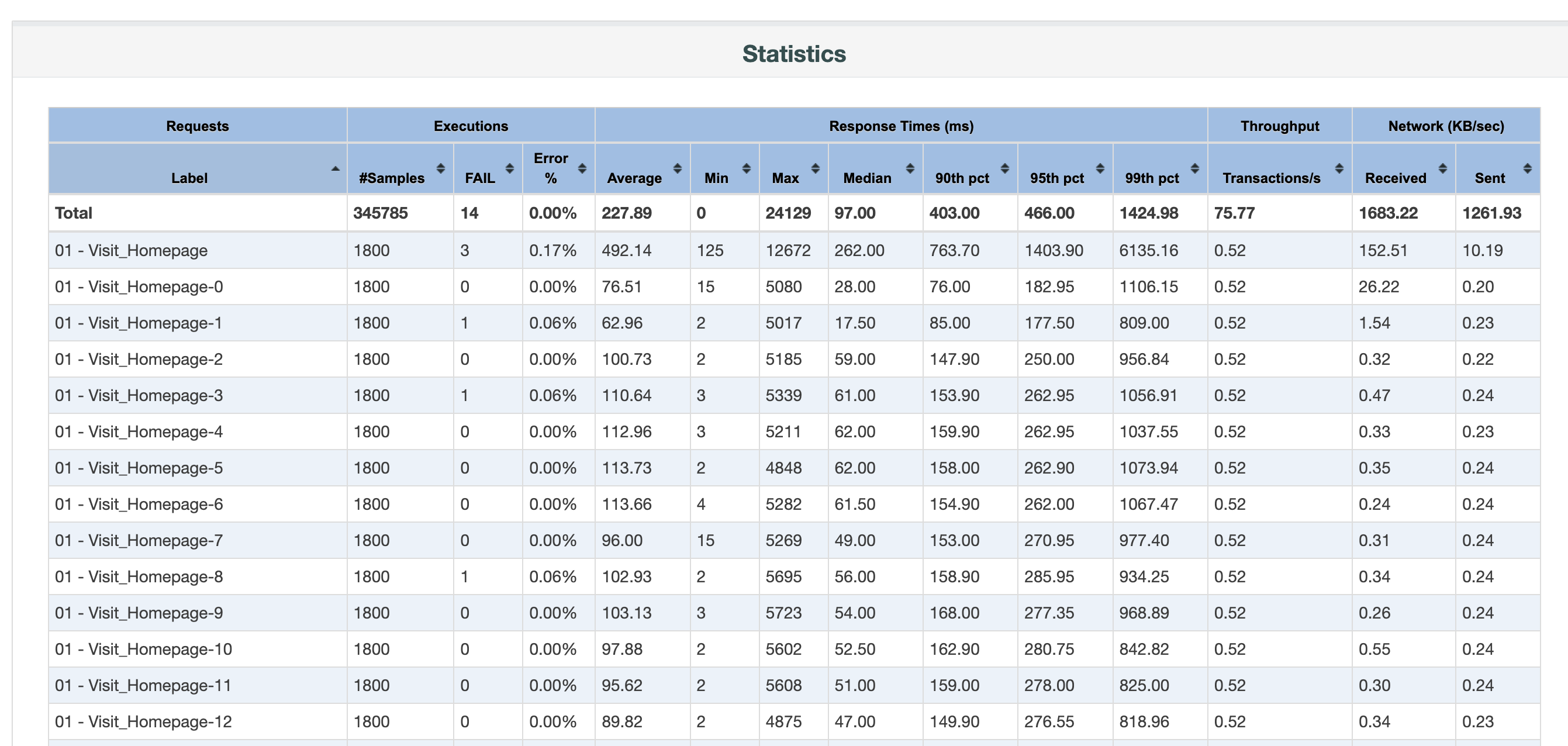
The Statistics table in JMeter Dashboard Report is an integral part of performance testing analysis due to its comprehensive view of test results. It presents summarized information, including the average, median, and percentiles of response times, error percentage, throughput, and more, all of which help identify bottlenecks in application performance. Understanding the Statistics Report is crucial as it provides valuable insights into application behavior under different load conditions; thus, it aids in determining scalability, reliability, and capacity planning. It forms the basis to uncover potential performance issues, optimize system performance, and ensure a seamless user experience.

JMeter Statistics in Dashboard Report

Detailed Analysis of the Aggregate Report

The detailed analysis of the Aggregate Report in JMeter involves examining various columns that provide information about the performance of the application. Key metrics include:

  • Label Name: name of a sampler.
  • Number of Samples: the total number of requests made.
  • Average, Min, Max, Median, 90th, 95th and 95th percentile: These indicate the various response times, respectively, providing a clear perspective on overall application performance.
  • Throughput: Number of requests per unit of time that your application can handle.
  • Number of failed requests and Error %: This presents the total number of failed requests and their rate as compared to the total requests, signaling issues if the value is high.
  • Network - Received and Sent: The amount of data being transferred in both directions, represented as KB/sec.

Each of these columns in the Statistics Report furnishes a different piece of the performance puzzle. They collectively give us a well-rounded view of the system's performance under assorted load conditions. Detailed analysis of these metrics helps to detect weak attributes and areas that need further improvement to ensure an optimized and seamless user experience. This analysis also helps us establish a foundational understanding of the system requirements, guiding strategic improvement plans and facilitating better performance.

Interpreting the Results From the Statistics Report

Interpreting results from the JMeter Statistics Report involves deciphering data from each column to gain insights into application performance. For instance, prolonged response times indicates potential performance hiccups, while variations in Min and Max response times could imply inconsistent performance. A high Error % could be a red flag reflecting issues with server capacity or backend programming. Low throughput value together with long response times, most likely means a bottleneck in the application or infrastructure. By correctly reading and interpreting this data, you can identify potential problem areas, such as system stress points, bottlenecks, or areas of inefficiency. These insights provide a useful foundation for defining corrective measures and performance optimization strategies.

It helps you develop a forward-looking perspective and create an action plan to enhance your performance strategy, ensuring a robust and seamless user experience.

Limitations of the Statistics Report

While the Statistics Report in JMeter Dashboard is indispensably beneficial, it possesses limitations. Primarily, it cannot display the values over time, for this, we need to have a look at the included graphs. For instance, the throughput could seem acceptable but by looking at the graph we could spot some drops in the performance that would be worth further investigation. This applies to most of the provided metrics - we need to have a look at the graphs to spot the patterns of potential performance hiccups. The Statistics table misses for instance a standard deviation, a measure of how much the data deviates from the mean or average value. It provides valuable insights into the consistency and reliability of a given metric. Another drawback is that finding the respective graph for a given label requires you to go to another tab and find the correct label among the others. Last, but not least, it's not very easy to compare those metrics with another report, for instance, you want to assess the new changes in your application and compare it with the state before those changes. That's where JtlReport could be handy. It addresses all the above-mentioned issues: easy test report comparison, configurable request statistics including the standard deviation, graphs integrated into request statistics table and much more.

· 5 min read

JMeter, also known as Apache JMeter, is a powerful open-source software that you can use to perform load testing, functional testing, and performance measurements on your application or website. It helps you understand how your application behaves under different levels of load and can reveal bottlenecks or issues in your system that could impact user experience.  This article will guide you on how to generate a JMeter Dashboard Report, ensuring that you utilize this critical tool productively and effectively for your application performance optimization.

Software Requirements

To generate a JMeter Dashboard Report, certain software prerequisites must be met. Firstly, Apache JMeter, the load-testing tool, should be installed on your system, with the latest stable release preferred. Secondly, given JMeter's Java base, you'll also need to install the Java Development Kit (JDK), preferably the latest version. Don't forget to set your JAVA_HOME environment variable to your JDK installation path. Lastly, depending on your testing needs, additional plugins or applications may be necessary for data analysis or software integration with JMeter.

Detailed Step-by-step Guide on How to Generate JMeter Dashboard Report

Setting up the Environment

First, confirm that JMeter and JDK are installed correctly. You can do this by opening a command prompt (or terminal in Linux/Mac) and typing jmeter -v and java -version. These commands should return the JMeter and JDK versions installed on your PC, respectively. Next, open JMeter application. Choose your preferred location to store the output. It should be a place where JMeter can generate results and graphs. Set up your test plan. A test plan specifies what to test and how to run the test. You can add a thread group to the test plan and configure the number of users, ramp-up period, and loop count, among other parameters.

Planning and Executing the Test

Add the necessary samplers to the thread group. Samplers tell JMeter to send requests to a server and wait for a response.  Now add listeners to your test plan. Listeners provide access to the data gathered by JMeter about the test cases as a sampler component of JMeter is executed. Execute your test plan. You can run your test by clicking the "Start" button (green triangle) on the JMeter tool's top bar.

Generating the Report

To create your Dashboard Report from the JTL file, go to the command line, navigate to your JMeter bin directory, and use the following command:

jmeter -g [path to JTL file] -o [folder where dashboard should be generated].

After running this command, JMeter generates a Dashboard Report in the specified output folder. This report includes various charts and tables that present a visual analysis of your performance test.

jmeter report summary

Understanding JMeter Dashboard Report

  1. Top Level (Summary): This section provides an overview of the test, including test duration, total requests, errors, throughput (requests per second), average response time, and more. 
  2. APDEX (Application Performance Index): This index measures user satisfaction based on the response times of your application.
  3. Graphical representation of Results: JMeter includes various charts such as throughput-over-time, response-time-over-time, active-threads-over-time, etc. Each of these graphs provides a visual representation of your test's metrics over different time spans.
  4. Request Summary: This table provides more detailed information for each sampler/request, such as median, min/max response times, error percentages, etc. jmeter report statistics

Key Metrics in the Report

Some of the essential metrics you will come across in a JMeter Dashboard report include:

  1. Error %: The percentage of requests with errors.
  2. Throughput: Number of requests per unit of time that your application can handle.
  3. Min / Max time: The least / maximum time taken to handle the requests.
  4. 90 % line: 90 percent of the response times are below this value.

Interpreting the Report

Interpreting the Dashboard Report involves looking at these metrics and evaluating whether they meet your application's performance requirements.

  1. The Error % should ideally be zero. Any non-zero value indicates problems in the tested application or the testing setup.
  2. High throughput with low response time indicates good performance. However, if response time increases with throughput, it might signal performance issues.
  3. The 90% line is often taken as the 'acceptable' response time. If most of the response times (90%) are within this limit, the performance is generally considered satisfactory.
  4. The APDEX score, ranging from 0 to 1, should ideally be close to 1. A value less than 0.7 indicates that the performance needs improvement. By understanding these key points, you can interpret JMeter Dashboard Report effectively, enabling you to draw conclusions about your application's performance and plan improvements accordingly.

Conclusion

The JMeter Dashboard Report is a powerful tool that provides insights into the performance of your website or application. This extensive and visual report allows you to ascertain the performance bottlenecks and potential room for optimization, thereby enabling you to enhance the end-user experience.

Alternatively, you can get performance testing reports with JtlReporter. With JtlReporter, you can quickly and easily create comprehensive and easy to understand performance test reports for your system with metrics, such as requests per second, various percentiles, error rate, and much more. Additionally, you can compare test runs side-by-side, create custom charts with any metrics available, and set up notifications for external services to be informed when a report is processed and more.

Try JtlReporter today and get detailed performance test reports with ease!

· 4 min read

Performance testing is a crucial step in ensuring that a software application can perform optimally under stress. Taurus is an open-source performance testing tool that simplifies performance testing, offering developers and testers a complete performance testing environment. This tool supports different protocols such as HTTP, JMS, JDBC, MQTT, and others. In this article, we will look at Taurus, its features, and how to use it.

Features of Taurus

Taurus has numerous features that make it a great tool for performance testing. Below are some of its key features:

  1. Support for Multiple Protocols: Taurus supports various protocols, including HTTP, JMS, JDBC, MQTT, and others, making it a versatile tool.
  2. Easy Test Creation: With Taurus, creating a test script is easy. You can create your script using YAML or JSON format, or use existing scripts from popular performance testing tools like JMeter, Gatling, and Locust.
  3. Cloud Integration: Taurus supports integration with cloud-based testing platforms such as BlazeMeter. This feature allows you to run performance tests on the cloud, helping you save on hardware costs.
  4. Real-Time Results and Reporting: Taurus provides real-time results and reporting, allowing you to analyze your test results as they happen. This feature is critical in identifying performance issues quickly.
  5. Compatibility with CI/CD: Taurus is compatible with Continuous Integration/Continuous Delivery (CI/CD) systems such as Jenkins and Travis. This compatibility allows for easy integration with the development pipeline.

How to Use Taurus

Using Taurus is relatively easy and straightforward. Here's a step-by-step guide on how to use Taurus:

Step 1: Create a Test Scenario

To create a test scenario, you need to define a YAML file that contains the test configuration. A YAML file is a human-readable text file that uses indentation to indicate the structure of data. In the case of Taurus, YAML files define the test scenario, which includes the testing tool to be used, the location of the test script, and the test configuration parameters. Here's an example of a simple test scenario for testing a web application using the JMeter testing tool:

execution:
- concurrency: 10
ramp-up: 1m
hold-for: 5m
scenario: with_script

scenarios:
with_script:
script: script:path/to/test_script.jmx

In the above example, the test scenario contains the JMeter test script located at path/to/test_script.jmx.

The test will be executed with a concurrency of 10 users, a ramp-up time of 1 minute, and a hold time of 5 minutes.

Step 2: Run the Test

To run the test, you need to execute the following command in the terminal:

bzt path/to/test_scenario.yml

Optionally, you can override any value from the YAML in the CLI command. Let's say we want to increase the concurrency:

bzt path/to/test_scenario.yml -o execution.concurrency=50

The test will be executed with a concurrency of 50 users now. This -o switch capability could be leveraged even leveraged in the CI, where we could easily parameterized the execution variables.

Step 3: Monitor the Test Results

Taurus provides real-time test results and reporting, allowing you to monitor the test results as they happen.

Step 4: Analyse the Test Results After the test is completed

Thanks to Taurus modularity, you have several reporting options at your disposal:

  1. Console Reporter - provides a nice in-terminal dashboard with live test stats and is enabled by default.
  2. BlazeMeter Reporter - allows you to upload test results to BlazeMeter application, that saves your data and generates interactive UI report with many metrics available. But its free version is very limited though.
  3. Final Stats Reporter - this rather simple reporter outputs a few basic metrics in the console log after test execution, such as number of requests and failures, various percentiles or latency.

Alternatively, you can integrate Taurus with JtlReporter. With JtlReporter, you can quickly and easily create comprehensive performance test reports for your system with metrics, such as requests per second, various percentiles, error rate, and much more. Additionally, you can compare test runs side-by-side, create custom charts with any metrics available, and set up notifications for external services to be informed when a report is processed and more.