
5 posts tagged with "metrics"

View All Tags

· 3 min read

Performance testing is a crucial element in software development, revolving around evaluating and validating efficiency, speed, scalability, stability, and responsiveness of a software application under a variety of workload conditions. Conducted in a controlled environment, performance testing is designed to simulate real-world load scenarios to anticipate application behavior and responsiveness in terms of cyber traffic or user actions.

What's a standard deviation?

Standard deviation is a commonly used statistical measure that is used to assess the variability or spread of a set of data points. It is a measure of how much the data deviates from the mean or average value. It provides valuable insights into the consistency and reliability of a given metric, which can be useful in spotting potential performance bottlenecks. A low standard deviation indicates that the data is tightly clustered around the mean, while a high standard deviation indicates that the data is spread out over a wider range.

Importance of Standard Deviation in Performance Testing

The role of standard deviation in performance testing is profound. It provides an objective measure of the variations in system performance, thus highlighting the stability of the software application. A higher standard deviation indicates a high variation in the performance results and could be symptomatic of inherent problems within the software, while a lower or consistent standard deviation reflects well on system stability.

Thus, the inclusion of standard deviation in performance testing is not just informative but also crucial for a focused and efficient optimization of system performance. It serves as a compass for test engineers, guiding their efforts towards areas that show significant deviations and require improvements. This makes the power of Standard Deviation indispensable when conducting performance testing.

Practical Examples of Standard Deviation in Performance Testing

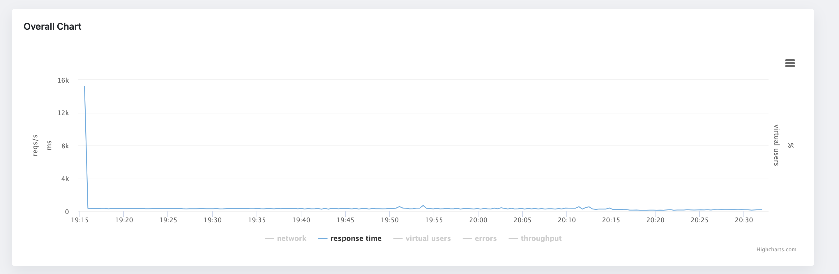
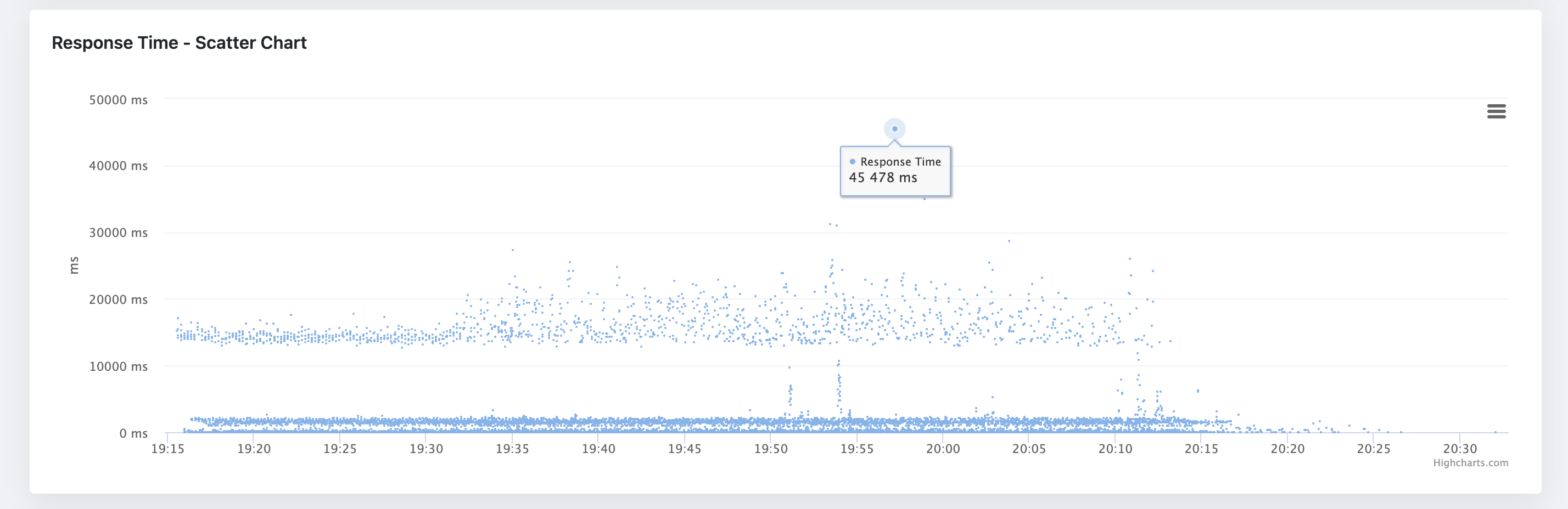
For instance, if the software's response time observations have a lower standard deviation, it conveys consistency in the response times under variable loads. If there is a higher standard deviation, as a tester, you would need to delve further into performance analysis, pinpointing the potential bottlenecks. It essentially acts as a roadmap, directing you towards the performance-related fixes required to achieve an optimal-performing website or application. The standard deviation represents the data and its distribution pattern. If the standard deviation is greater than half of its mean, it most likely means that the data is not formed in a normal distribution pattern. The closer the data is to the normal distribution pattern (bell curve), the higher the changes that the measured data do not include any suspect behavior.

Incorporating Standard Deviation in Performance Testing Reports through JTL Reporter

In this digital era, leveraging the power of analytical tools to assess software performance has become essential. JTL Reporter is such a captivating platform that aids in recording, analyzing, and sharing the results of performance tests. This platform effectively integrates standard deviation measurement in performance testing, offering a holistic overview of system performance and stability and, thereby, proving invaluable in making informed testing decisions.

· 3 min read

Performance testing is a critical process that ensures the quality, reliability, and optimal performance of software applications under specific workloads, speed, and stability. One of the key metrics used in performance testing is "Percentile." This article aims to provide a detailed insight into percentiles and how they contrast with averages in the context of performance testing.

Understanding Percentiles

A percentile is a measure in statistics that indicates the value below which a given percentage of data falls. In performance testing, percentiles give testers an indication of the distribution characteristics of response times. It helps to quantitatively assess the load handling capacity, stability, and responsiveness of the system under testing. A 95th percentile, for instance, means that 95% of the observed data fall below that value.

How Percentiles are Used in Performance Testing

In performance testing, percentiles are used to provide a more nuanced picture of how a system performs across a range of loads. For instance, if in load testing, a system's 95th percentile response time is 2 seconds, it means that 95% of the users are experiencing response times of 2 seconds or less. This leaves 5% who experience more than 2 seconds.

In real-world usage we want to have more percentiles at our disposal - usually in performance testing reports 50th, 90th, 95th, and 99th percentiles are used. Very often percentiles are used to establish performance KPIs in performance testing.

Difference Between Percentiles and Averages

While percentiles and averages are both statistical measures used in performance testing, they depict different aspects of the data. The average, or mean, is the sum of all values divided by the number of values. It acts as the balance point of the data set, but it may not necessarily represent a "typical" user experience.

Percentiles, on the other hand, show the distribution across the range of responses. Comparatively, they are more useful for understanding the consistency of system performance. For instance, if a small number of server requests take a long time to complete, the average response time will increase even if most requests are completed quickly – potentially giving a misleading picture of overall performance, whereas, with percentiles, you can clearly see that most of the responses are quick, with only a few long ones. For this reason, the average is not a recommended metric to be used for KPIs.

By understanding and interpreting these statistical measures properly, organizations can enhance the quality, reliability, and usability of their software applications, leading to improved user experience and business productivity. Performance testing, backed by accurate data interpretation, is hence the key to deriving maximum value and efficiency from any software application.

· 3 min read

As a performance tester, one of the most important tasks is to correctly analyze the performance testing results. Although it might look like an easy task, the opposite is true here. When looking at the performance test report metrics and charts, there are many hidden traps. The biggest one is, the data you are looking at are aggregated. The problem with aggregated metrics is that they hide information from you (and averages are among the worst here), like very small spikes in response times. But those spikes still pose a performance bottleneck, that needs to be solved.

One of the most effective ways to visualize performance testing data is through scatter charts. It is particularly useful in performance testing because it can help you to identify patterns and trends in your raw data, as well as potential performance issues. Look at the following example of aggregated chart displaying an average response time of a web application:

Average Response Time

As you can see, the information we can get from this chart is limited. It does not show almost any pattern in the data. The only thing we can read from it, there was initially a spike in response times (still worth investigating further as this looks like a performance bottleneck), but besides that, that's all we can get from this chart. Now, let's look at the same data, but this time in a scatter chart:

Scatter Chart

The scatter is more informative than the average response time chart. It shows us that the response times are grouped into three clusters. The banding pattern is usually fine, but in this case, the spacing between the clusters seems to be bigger than desired - the clusters are roughly defined around 0-100ms, 1000-200ms, and 12000-2000ms. Another pattern we can see here is that on some occasions, the response times form almost a vertical line. This might signify a performance bottleneck in the application as something might be blocking the request processing. And last, but not least, we can see that there are some outliers in the data. The outliers are the points that are far away from the rest of the data. The question here is, are they outliers or do they have statistical significance? Again, here we would need to investigate further and run the test multiple times to see if the outliers are consistent.

In this quick introduction, we have learned how scatter charts can help us to analyze performance testing outputs, and reveal patterns and trends in the data, that are otherwise hidden in the aggregated charts. Luckily, the scatter chart is now included in the JtlReporter in the latest version, so you can get even more out of your performance testing data and make better decisions about your application performance.

· 4 min read

As technology continues to advance, organizations are becoming increasingly reliant on computer systems to support their operations. To ensure that these systems are performing optimally, it is essential to measure their performance. A good performance test report will contain many metrics, but they can be a bit difficult to understand for non-professional performance testers. That’s when the APDEX (Application Performance Index) metric can become very useful as it is a simple and easy-to-understand metric that helps organizations understand how well their systems are performing and identify areas for improvement. In this blog post, we will explore what the APDEX metric is, how it works, and its advantages and disadvantages.

What is the APDEX Metric?

The APDEX metric is a standardized way of measuring the performance of computer systems. It is based on the response time of a system, which is the amount of time it takes for a system to respond to a user request. The APDEX metric is calculated using a formula that takes into account the number of satisfactory, tolerable, and unsatisfactory responses.

How Does it Work?

To calculate the APDEX score, organizations need to set two thresholds for response time. The first threshold is the satisfactory threshold and the second is the tolerable threshold. They are set based on the specific requirements of the system. Once the thresholds are decided, the APDEX formula is applied to the response time data. The APDEX formula is as follows: APDEX = (Satisfied Count + (Tolerated Count/2)) / Total Count

Where:

  • Satisfied Count is the number of responses that fall within the satisfactory threshold
  • Tolerated Count is the number of responses that fall between satisfactory and tolerating thresholds
  • Total Count is the total number of responses

The resulting score ranges from 0 to 1, with 1 being the best possible score. Based on the APDEX score the application’s performance is assessed:

  • Excellent, 1-0.94
  • Good, 0.93-0.85
  • Fair, 0.84-0.70
  • Poor, 0.69-0.50
  • Unacceptable, below 0.50

Advantages of the APDEX Metric

The APDEX metric has several advantages that make it a popular choice for application performance measurement. Some of these advantages include: Simplicity: The APDEX metric is easy to understand and use, making it accessible to organizations of all sizes and technical abilities. Standardization: The APDEX metric is a standardized tool, which makes it easy to compare the performance of different systems. Flexibility: The threshold for response time can be adjusted to suit the specific requirements of the system, which means that the APDEX metric can be applied to a wide range of systems.

Disadvantages of the APDEX Metric

Despite its popularity, the APDEX metric has also disadvantages that must be taken into account. Some of these disadvantages include: Lack of Variability: The APDEX metric does not account for the variability of performance over time, which means that it may not capture performance issues that occur at specific times or under certain conditions. Limited Scope: The APDEX metric is only based on the response time of a system, which is not the only factor that contributes to the user experience. Factors such as the availability of the system, reliability of the system, and functionality of the system also play a significant role in determining the user experience.

Conclusion

The APDEX metric can be a useful tool for measuring the performance of computer systems. It is easy to use, standardized, and flexible. However, it also has some limitations that must be considered before using it. Organizations should use a combination of metrics to get a more complete picture of system performance.

In recent release of JtlReporter the support for measuring the APDEX score was added. You can get the APDEX score for you JMeter or Locust.io test reports from now on - either get started with JtlReporter or upgrade your instance to the latest version. The metric was made optional and can be turned on in the scenario setting, while both threshold values are adjustable according to your specification and requirements of your system.

· 3 min read

Performance testing metrics are measurements that are used to evaluate the performance of a system or application under a given workload. These metrics help identify any issues or bottlenecks in the system and provide insights on how to improve its performance.

There are various performance testing metrics that can be used, depending on the specific goals and objectives of the test. Some common performance testing metrics include:

  1. Response time: This is the amount of time it takes for a request to be processed and for a response to be returned. A high response time can indicate that the system is overloaded or that there are bottlenecks in the system. For performance analysis it is very useful to use percentiles. The most common percentiles are p90, p95 and p99.
  2. Throughput: This is the number of requests that a system can handle per unit of time. A high throughput is desirable, as it indicates that the system can handle a large volume of traffic.
  3. Error rate: This is the percentage of requests that result in an error. A high error rate can indicate that the system is not functioning properly and needs to be optimized.
  4. Resource utilization: This is the percentage of a system's resources (such as CPU, memory, and network bandwidth) that are being used during the test. High resource utilization can indicate that the system is reaching its limits and may need to be scaled.

It's important to choose the right performance testing metrics for your specific goals and objectives. For example, if you're testing the performance of a web application, you may want to focus on metrics such as response time and error rate. If you're testing the performance of a database, you may want to focus on metrics such as throughput and resource utilization.

Performance testing metrics are an essential part of evaluating the performance of a system or application. By choosing the right metrics and monitoring them during the testing process, you can identify any issues or bottlenecks and make informed decisions on how to improve the system's performance.

JtlReporter can help you to gather all the above-mentioned (and many more!) metrics from your tests created with JMeter, Loucst.io and other performance testing tools. But it does not stop there. JtlReporter gives you the ability to customize the displayed metrics. Not to mention that the metrics are also displayed in comprehensive graphs. You can even easily compare the metrics with your other performance testing runs to find out any changes in performance of your application.